Sorry Coke. I know it has become the norm to have a pop at large consumer brands, but honestly, if you’re going to run a text to win competition, at least have a crack at making it easy for people to enter.
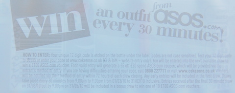
In an idle 10 minutes, my eye was caught by Coke’s text to win competition where you can win an ASOS outfit every 30 minutes and I thought I’d see what it was like to enter from a consumer’s point of view. The answer was ‘terrible’. Have a look at the label and entry instructions below.
There are so many problems here, it’s hard to know where to start.
Let’s kick off with the font size of the instructions. It’s tiny. I could barely read it. The short code that I was supposed to text my code to was buried in a long paragraph; hardly attention grabbing. There’s also no contrast between the text colour and the white background, so you have to squint and turn it to the light to make sense of it.
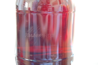
Having read the instructions, my next task as an eager consumer was to identify my code which ‘is etched on the bottle under the label’. No it isn’t. I removed the label and there’s nothing there. Hang on, what’s that? You’ve got to be kidding. Barely visible in broad daylight, I could just make out the code against the dark contents.
The code is also absurdly long. It’s 12 digits! I tried to work out how may possible code combinations there would be and my calculator returned E.1.032282. So it’s basically trillions. I know Coke is a massive brand but we’re not all putting away 100 litres of the stuff a day. The National Lottery makes do with 6 numbers for goodness sake.
There are just so many reasons why you wouldn’t bother entering this competition. I’m not suggesting that it has failed but they could have at least doubled their response if they had made it easier to enter.
We’re currently working with regional brewery Wickwar, who are running a text to win competition on their bottled beer, Banker’s Draft. We’ve tried to keep the entry instruction as simple and as clear possible to try to maximise response.
I’m not suggesting that this is perfect and we obviously don’t have control of the creative side of things, but we do believe it’s better than Coke’s attempt, even having to work with tiny amount of space on the label.


